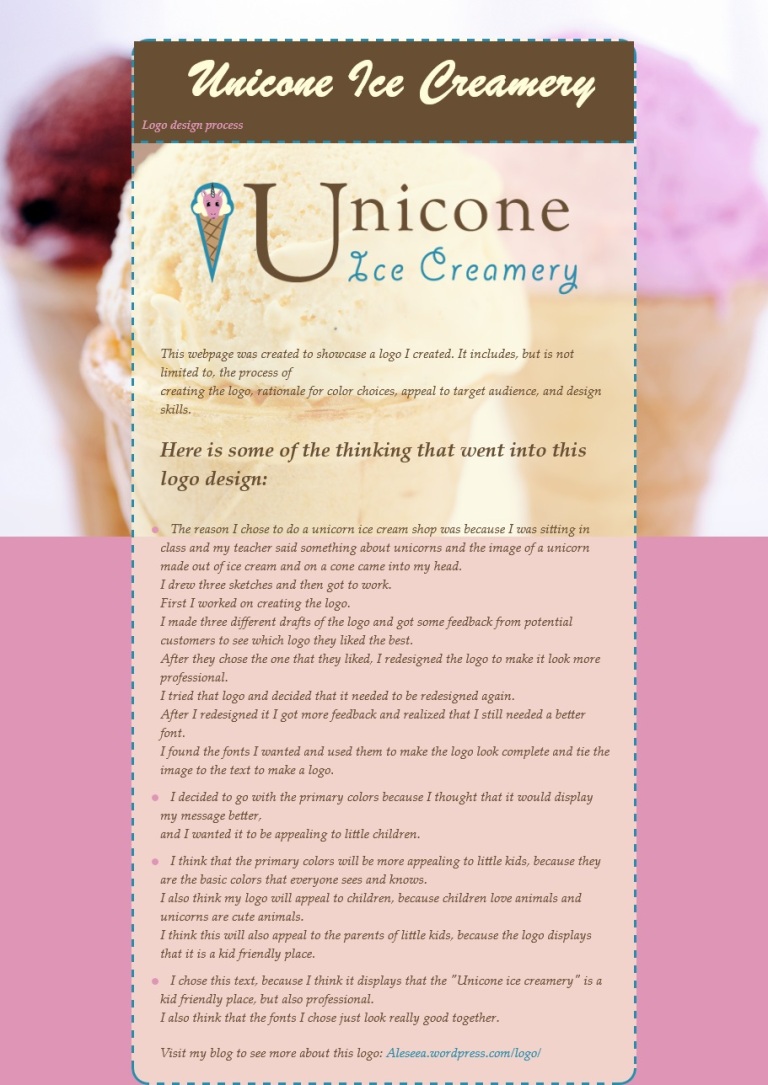
Description: This is a screenshot of a webpage I made to showcase my logo
Process (Programs, Tools, Skills): I used both Text Wrangler and notepad++
Message: Come buy some ice cream!
Audience: Parents with little children or people who want ice cream.
Top Thing Learned: CSS can be a pain, but I like it.
Color scheme and color hex(s):
Blue: #288CAC
Pink: #DE95B6
Brown: #684E33
Cream: #FFFCD9
Title Font Families & Category: ‘Brush Script MT’, cursive;
Copy Font Families & Category: “Palatino Linotype”, “Book Antiqua”, Palatino, serif;
Changes made to the CSS: I changed the fonts, sizes, colors, and I made the whole thing responsive. I also added the background image and changed the values of most of the attributes, and added a bunch of attributes. Basically I kept the basics, but changed almost everything else so it would be responsive.
Word Count: 341

Wow, this looks so great Aleseea! I can tell that you put a lot of work into it. The background image is awesome because it adds to the theme and purpose of the company. Your logo has improved so much, too! I’m not sure how you did it all, but I love what you did here. Great job! Here’s mine – https://erinmcmahonportfolio.wordpress.com/2015/11/22/project-7-web-page/
LikeLiked by 1 person
I knew you were going to blow this one out of the park. Your design is super cute. I love the colors and the typography the most! I love how “logo design process” in the corner of your title. I have no idea how you did that, but it looks great. The webpage matches the logo really well and I just love it all.
Check out my blog and see what you think! https://mkdotson.wordpress.com/2015/11/21/project-7-webpage/
LikeLike