Project Corrections / Time spent: I made a new project instead and it was a wedding invitation. It took me 3 hours and 47 minutes to complete.
Message: Hire me, because I have some great designing skills
Audience: People who are looking to hire a visual media designer
Top Thing Learned: That making a portfolio is harder than it looks, because you must make every page individually and then rearrange them if you change your mind about the order you want the pages in.
Future application of Visual Media: I can use in in my callings in the church to make the ward program, or fliers for an upcoming event.
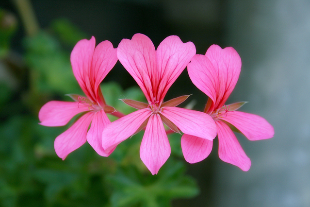
Color scheme and color names: Monochromatic, Pink
Title Font Name & Category: Lucia BT, Cursive
Copy Font Name & Category: Helvetica CY, SanSerif
Thumbnails of Images used:
Sources (Links to images on original websites / with title of site):

I LOVE how you implemented the text wrap in your portfolio. That is the perfect picture to do it with. I love how you kept things super consistent and united throughout the entire portfolio. Great job girl! Check out my portfolio: https://megangrahamphotography.wordpress.com/2015/12/12/project-9-portfolio/
LikeLiked by 1 person
Aleseea, you knocked this out of the park. I love the text wrap around your flowers, that was such a smart idea. The black and hot pink have such great contrast. Your designs are out of this world incredible, just like you! I love your message. That is basically what everyone is going for right? Good job, chicklet!
Here’s another portfolio that looks awesome!
https://caitlineliseblog.wordpress.com/design/?preview=true&preview_id=2&preview_nonce=3de8b87794
LikeLiked by 1 person
Aleseea, I loved how you used the photo in your portfolio. The text wrap was especially nice! The black background was a good choice, as it helped the color of the flowers “pop out” a little bit more. Also gave it a bit of a classier feel.
Check out this other awesome portfolio:
https://trufflelily.wordpress.com/2015/12/13/p9-portfolio/comment-page-1/#comment-23
LikeLike